Painting the Future: A Palette for Retail Success

In the vibrant retail world, your commercial venue's aesthetics play a pivotal role in shaping customer perceptions and enhancing the overall shopping experience.
As part of a retail store renovation, the choice of paint colours becomes a strategic decision that can influence brand recognition, customer engagement, and the overall ambience of the space. In this article, let's dive into the art of choosing colours for your commercial venue, exploring the impact on brand identity and providing practical tips tailored for various businesses across Australia.
The Power of Colour: Building Brand Identity
Reflecting Your Brand's PersonalityYour brand's personality should resonate through the walls of your retail space. For instance, a health store might opt for calming greens to convey a sense of well-being, while an auto parts store could embrace bold blues to evoke trust and reliability. Consider the emotions you want to produce and align your colour choices with your brand's character.
Consistency is Key
According to Commercial Painting Specialists Warren and Sons, consistency across brand elements fosters recognizability.
Choose colours that align with your logo, marketing materials, and overall brand palette. This cohesion reinforces your brand identity, making connecting the visual elements with your business easier for customers.
Cultural Considerations
In Australia, colours can hold cultural significance. For example, warm, earthy tones may resonate with the country's natural landscapes, creating a sense of familiarity. Be mindful of cultural nuances and preferences when selecting colours to ensure they resonate positively with your target audience.
Colour Harmony: Complementary Choices for Different Businesses
Health Store with Natural Hues for Wellness
Colour Palette
Soft greens, calming blues, and earthy tones.
Why? These colours evoke a sense of nature and health, aligning with health stores' holistic and wellness-focused ethos.
They create a serene atmosphere, promoting a positive and soothing shopping experience.
Australian Example
"The Green Dispensary" pharmacies often incorporate calming greens into their interior design, creating a harmonious space that aligns with their health-focused brand.
Auto Parts Store using Trustworthy Blues and Grays
Colour Palette
Deep blues, metallic greys, and sleek blacks.
Why? These colours convey reliability, professionalism, and a sense of precision—qualities customers look for in auto parts. Blues are associated with trust, making them a suitable choice for businesses in the automotive industry.
Australian Example
Supercheap Auto, a popular auto parts retailer, often uses a combination of deep blues and greys, creating a space that reflects reliability and expertise.
Accounting Firm and Professional Neutrals
Colour Palette
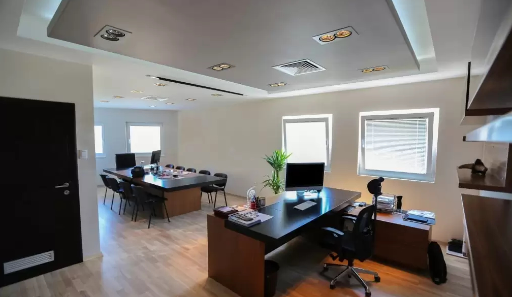
Warm neutrals, muted greys, and subtle browns.
Why? Neutral tones exude professionalism and sophistication. These colours create a backdrop that emphasizes a commitment to accuracy and reliability, crucial qualities in the accounting sector.
Australian Example
H&R Block, a well-known tax preparation company, often uses a palette of neutrals in their offices, establishing an atmosphere of professionalism and trust.
Choosing the Right Paint Types
Matte Finishes for Elegance and Uniformity
Matte finishes are ideal for creating a sophisticated and uniform appearance.
They reduce glare and provide a smooth texture, making them suitable for various retail environments, from fashion boutiques to electronic stores.
Satin Finishes for Durability with a Hint of Shine
Satin finishes offer a touch of sheen while maintaining durability. They are easy to clean, making them suitable for high-traffic areas. Consider satin finishes for spaces like cafes or convenience stores that may require frequent cleaning.
High-gloss finishes that are Bold and Attention-Grabbing
High-gloss finishes are reflective and add a bold, attention-grabbing element. They work well in spaces where you want to highlight specific features, such as product displays or promotional areas.
Brushing Towards Success
The colours you choose for your commercial venue are more than paint on the walls—they are a canvas that tells your brand story. Whether you're transforming a health store, auto parts shop, or accounting firm, understanding the psychology of colour and its impact on brand perception is vital.
So, grab your paintbrush and let your brand's personality shine through, creating a retail space that draws in customers and keeps them coming back for more.

